Posts

Paths of Glory

Image
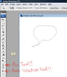
Word balloons seem so simple in the beginning. The first time you make one in Photoshop, you just draw an oval with the Elliptical Marquee Tool. After a while, the symmetry starts to bug you, so you decide to draw your word balloons by hand with the Brush Tool. Really, really slowly. But they still look kinda crappy. Before long, word balloons have become a source of sadness in your life. Well, there's a third path. That path is Paths. Why are paths so good for word balloons? Three reasons. First, you get super-clean, super-even lines. Second, you can modify them (if you change the words -- which you will -- it's no big deal to modify the dimensions of an already-placed balloon). Third, they're reusable. You can save all your paths into a single file and use them in future pages. Here's how you do it (more accurately, here's how I do it, and I probably do it oddly, so please feel free to offer your own techniques in the comments section): First, let's make a pa...

Gonnamakeit. Gonnamakeit.

Image
Page sixteen is underway. The last time I'll need to draw any rocks, swords, or trees for some time. Eight pages to go. Two thirds done. I can't show any of the new stuff here, but rest assured that I'm mere decades away from finishing this issue. So slow. Here's what the grown-up part of my brain tells my inner Chicken Little when things get really bad: don't confuse speed with efficiency. Quality is a variable in the first case, but a constant in the second. Eliminating waste, automating repetitive tasks, honing drawing skills, and cultivating self discipline are all worthwhile efficiency improvements. If you're doing everything you can in these areas and people are still saying you're too slow, go to your local comic shop and look at the thousands of examples of what "fast" gets you. May lightning strike me down on the day I tell someone that they've got to draw a page per day to be successful in comics. That sentence really means "I ne...

Phase One, in which Doris Gets Her Oats

Image
I've scoured the internet in search of other folks who are making DIY comics, and there are some very inspiring blogs on the subject (I recommend reMIND , Near Death , and Wormworld , for starters). While there are quite a few examples of people doing things right, I've learned a lot (maybe even more) from people doing things wrong. In fact, if I'm looking for instructive screw-ups, I need look no further than my own portfolio. This isn't the first time I've quit my job to attempt the summit of Mount Comic. My first try was called Gordon and the Stareater. By the summer of 2005, I had been working for a year and a half at an online game company in Seoul, Korea. It was a great setup -- I had gotten a promotion, I was living in a spiffy loft apartment in a swanky neighborhood, and I loved my coworkers. Still, my job didn't let me make art anymore and I felt a little out of place in the producer role. I did my best, but at some point it just didn't make much se...

Intermission

Image
A couple of months ago I mentioned that I had taken a short(ish) break from Project Waldo to draw a pinup for a real live comic. Well, an official announcement has been made, so I can finally talk about it. My first entry into the world of grown-up comics is this drawing for the upcoming Viking trade paperback from Image Comics (click to enlarge): Written by Ivan Brandon and illustrated by Nic Klein, Viking has earned some justifiable critical praise over the past year, mainly on the strength of Ivan's hard-boiled characters and Nic's gorgeous painterly style. I especially enjoyed the mini-romance that unfolds between Egil (a bloody-minded Viking version of the Tasmanian Devil) and a stray kitten that shows up after one of Egil's many gruesome head-splitting sessions. For my pinup, I tried to show how a kitten might express its affection for a Viking in terms the recipient would comprehend. It's hard to fully express how grateful I am to both Ivan and Nic for letti...

Out of Limes

Image
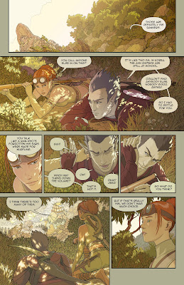
Page 7 first-pass color. Click to enlarge. Below, there will be moping. I spent some time revamping the linework for this page before diving into the color -- that bottom panel has been a big jerkface from the get-go. At some point I'll animate the billions of pose revisions that figure went through. Legs here, legs there, chin here, chin there, arm too skinny, arm too fat -- seen in time-lapse, she'll do quite a jig. Happily, I think I ended up with something fairly inoffensive. The color sort of irks me, though. In the interest of not taking forever, I've decided to leave it for now and come back to it when I've got some new ideas. In other news, I'll be doubling the resolution of my linework (from 3300x5100 to 6600x10200). My computer seems to be able to chew on this mega-bolus as long as I keep the layers reasonable, and I can knock it down to the lower resolution for the coloring pass. In the end, I can blow up the color layers to the higher resolution, and an...

Bubblicious

Image
Page 6 colorized. Click to enlarge. More after. I learned a new lesson this week: never draw speech bubbles directly into the original line art. I'm pretty sure somebody made a comment to this effect several months ago, but I'm a late bloomer . There are a few really good reasons not to bake speech bubbles into the drawing: The dialogue may need to change (as it did with this page). I may want to change the way I draw the bubbles, themselves (with this page, I switched from the old hand-drawn bubbles to stroked paths, which will be easier to modify in the future). I'm going to have to change the font (suggestions welcome), which means I'll have to resize the speech bubbles later, anyway. I want to publish the book in other languages, and I'll have to resize the bubbles to match the localized text. I may want to use the panels in an animatic someday, in which case I'll want the bubbles removed. If I ever want to sell prints of individual pages, they'...

Où est Waldo?

I'm not really sure how much traction I'll get on the strength of five colored pages, but it seems like a good time to start building relationships with European publishers. I'll be contacting the following companies tomorrow: Delcourt Casterman Soleil Les Impressions Nouvelles Dupuis Dargaud Le Lombard Frémok Glénat Les Humanoïdes Associés Standaard Uitgeverij This list is heavily weighted on the Franco-Belgian end of things (and by the way, thanks to everybody who tossed these names at me!). If anybody can suggest other companies that seem like a good fit (from any country or planet), please let me know. If you have any sort of direct contact with someone at a publishing company and think you might be able to get me past the submissions gatekeepers, your help would be much appreciated. I'm having the weirdest experience with Image -- a couple of their artists think Image would be all over Project Waldo, but I'm unable to get anything past their submissions guy. I ...