Posts

Showing posts from 2009

Out of Limes

Image
Page 7 first-pass color. Click to enlarge. Below, there will be moping. I spent some time revamping the linework for this page before diving into the color -- that bottom panel has been a big jerkface from the get-go. At some point I'll animate the billions of pose revisions that figure went through. Legs here, legs there, chin here, chin there, arm too skinny, arm too fat -- seen in time-lapse, she'll do quite a jig. Happily, I think I ended up with something fairly inoffensive. The color sort of irks me, though. In the interest of not taking forever, I've decided to leave it for now and come back to it when I've got some new ideas. In other news, I'll be doubling the resolution of my linework (from 3300x5100 to 6600x10200). My computer seems to be able to chew on this mega-bolus as long as I keep the layers reasonable, and I can knock it down to the lower resolution for the coloring pass. In the end, I can blow up the color layers to the higher resolution, and an

Bubblicious

Image
Page 6 colorized. Click to enlarge. More after. I learned a new lesson this week: never draw speech bubbles directly into the original line art. I'm pretty sure somebody made a comment to this effect several months ago, but I'm a late bloomer . There are a few really good reasons not to bake speech bubbles into the drawing: The dialogue may need to change (as it did with this page). I may want to change the way I draw the bubbles, themselves (with this page, I switched from the old hand-drawn bubbles to stroked paths, which will be easier to modify in the future). I'm going to have to change the font (suggestions welcome), which means I'll have to resize the speech bubbles later, anyway. I want to publish the book in other languages, and I'll have to resize the bubbles to match the localized text. I may want to use the panels in an animatic someday, in which case I'll want the bubbles removed. If I ever want to sell prints of individual pages, they'

Où est Waldo?

I'm not really sure how much traction I'll get on the strength of five colored pages, but it seems like a good time to start building relationships with European publishers. I'll be contacting the following companies tomorrow: Delcourt Casterman Soleil Les Impressions Nouvelles Dupuis Dargaud Le Lombard Frémok Glénat Les Humanoïdes Associés Standaard Uitgeverij This list is heavily weighted on the Franco-Belgian end of things (and by the way, thanks to everybody who tossed these names at me!). If anybody can suggest other companies that seem like a good fit (from any country or planet), please let me know. If you have any sort of direct contact with someone at a publishing company and think you might be able to get me past the submissions gatekeepers, your help would be much appreciated. I'm having the weirdest experience with Image -- a couple of their artists think Image would be all over Project Waldo, but I'm unable to get anything past their submissions guy. I

A Seattlite Yankee in King Louis' Court

Image
Page 5 first-pass color complete. Click to Enlarge. More below. This page is... well, I'll come back to it later and figure something out. I took some time off to do a pin-up for a real, live comic. It'll be my first-ever appearance in print. My rationale for breaking the no-side-projects rule was that Project Waldo might be taken more seriously by reviewers if it were perceived to have been drawn by a "real" comic artist. The theory was that I'd shed my hobbyist mantle by making an appearance in a well-known book. I'm not sure I should count that chicken before it's hatched, though, so I'll save the details for later. Meanwhile, my initial enthusiasm for Ka-Blam has been muted by a spate of anti-POD comments. There are several potential drawbacks: first, I'm prepping all the art in RGB (Ka-Blam's format), but I may run into some major headaches if I end up switching to a publisher who uses CMYK (pretty much all of the big ones). Second, it

Stick and Carrot

Image
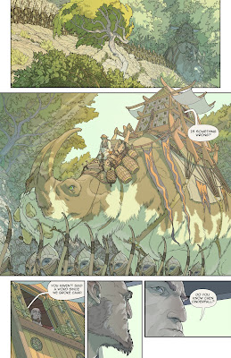
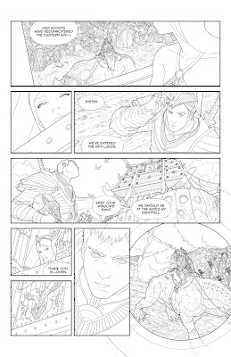
Page 8 lines complete. Click to enlarge. More below. Here's how it looked at the thumbnail stage (witness the moment when I realize diagonal panel boundaries exist): Talk about your trench warfare drawings -- this one was the battle of Verdun. If I have a nemesis, it's multiple panels depicting the same complicated object from different angles. And man, that saddle... Why, oh why, did I put netting around two of the barrels? Why would I do that, except to add even more time to the already interminable barrel-drawing task? I suppose it goes without saying that the bottom panel was a little cathartic. I think I may have put a little extra stink on that impact, just out of spite. Take that, pagoda-with-infuriatingly-complicated-beam-placement! If this page seems difficult to read, please join me in my fervent and possibly naive belief that color will make everything much more legible. Also adding to the long turnaround for this page was a week of thumbnailing for the rest of the i

Now With 100% Less Whining

Image
Page 4 first-pass color complete. Click to enlarge. More below. Here's why I love the internet: a month ago, I didn't know the word "flatting." Three weeks ago, I didn't know there were flatting plugins. Two weeks ago, it took me fifteen hours to flat a page using those plugins. This week, it took three hours. All because of comments on this blog. Holy shnikeys. I ended up trying Eagle's method -- that is, removing extraneous lines from the line art layer before running the plugins. Below are examples of the line art for this page in pre- and post-culled states. Note that in many cases all I had to do was make a "leak" in between two areas so that they filled with the same color. And here's what the plugins spat out. The second image is cleaner and more tractable. All it needs is a few dinks with the magic wand, and I'm on my way. By the way, I still used the high-noise version at left to add some nice random variation to large single-color a

Problem Solving

Image
Page 7 line art done. Click to enlarge. More chit-chat below the image. Aintitcool recently posted a great conversation with Steve Lieber, the artist who drew " Whiteout ." He shared a heap of good information about craft and process, but I was especially interested in the description of his emotional travails: "I was ... less-than-pleasant to my wife at times, because I was just inside the pages and couldn't see past the battle I was fighting with each one. I think I let being concerned about how the book was going to turn out turn me into someone who was less concerned about how everything else in my life was going to turn out ... I was a damned troll under a bridge. [laughs] I was just really unpleasant. I was solving new problems, and rather than feeling satisfied that I was solving new problems, I was getting angry because everything wasn't coming out perfect the first time I put a line down." I haven't quite gone to Troll Town, but I do see s

Flattened Earth Society

Image
First pass on page 3 color. Click to enlarge. Below, I will try to keep things brief and I will fail. I finally downloaded the Flatten and Multifill Photoshop plugins . Survey says... not a magic bullet, but they probably sped things up a little bit and definitely produced cleaner, more line-conformant results. In case you're curious, here's how they work: The plugins are easy to install -- just drag the files into Photoshop's plugins directory and they'll show up under "Filters." There's only one tricky step - the black and white line art (not black on transparent, mind you) must be completely de-anti-aliased (re-aliased?) before the plugin will work. It turns out that this is done by selecting Image->Adjustments->Threshold. Bump the slider a bit to the right until all your lines connect, and then run Multifill. Multifill automatically fills every closed area in the drawing with a unique color. Next comes Flatten, which removes all the black lines f

Nurpling

Image
Page six. Click to enlarge. More rambling below the image. As you're drawing the eight thousandth leaf in a drawing like this, you start to ask yourself what exactly it is that all this detail really gets you. The costs are obvious - the drawing goes more slowly, your wrist hurts, the legibility of the image can even suffer. So why do it? For one, meaningful detail helps to model form. If you've decided on a "clean" look (and I'm not sure why I decided that, but whatever), you can't fall back on crosshatching or shading to indicate surface contours. Adding detail is a way of showing the lie of a surface. For example, I drew all the seams on the girl's costume. It's not because I have a fondness for seams. It's that, drawn correctly, the seams turn your figure into a wire frame model . The same goes for belts, straps, buckles, shoelaces, and buttons. There are pitfalls -- if you go too dense, you can lose the silhouette. If you draw even the tiniest

Slow Ride

Image
Page 2 first pass color. Click to enlarge. More below. I'm kinda slow. Getting to go slowly is the reason I got into drawing in the first place. I've never been very good at activities that demanded real-time proficiency. Dancing, sports, party conversation -- even sketching in front of someone else makes me jumpy. I mean, what if someone saw me make a mistake? They'd judge me! They'd stop liking me and tell all their friends that they know a guy who is a below-average dancer! Improvisational comedy is so beyond my comprehension as to seem supernatural. The nice thing about drawing, though, is that you can start out with something really clunky and then chip away the things that don't work little by little. You can make as many mistakes as you want, and nobody will ever know about any of them! In the end, some of your mistakes will even turn out not to have been mistakes at all. Biological evolution works the same way -- start out with goop in a puddle and after a f

Paint by Numbers

Image
First-pass color on page 1. Click to enlarge. More after the image. Even more than with the original line art, it's taking me a long time to figure out whether something works or not. Right now, I'm mostly shooting from the hip. I know I don't want muddy color, and I'm avoiding using black for shadows. I'm trying to use new blend modes to modulate the color of the linework, itself (see leaves in background of panel 1). I'm also trying to keep all the panels on one page in the same color key (though I'm not sure I've pulled that off here). That connects to a bigger lesson I've been learning over the past month: a comic page isn't a collection of smaller drawings -- it is one big drawing, and the panel borders and speech bubbles are all part of the composition. One thing that makes me wince a little bit when I look at the old Stareater stuff is how much of an afterthought the speech bubbles are. They're these perfect ovals (just running a strok

Half Way to Ten

Image
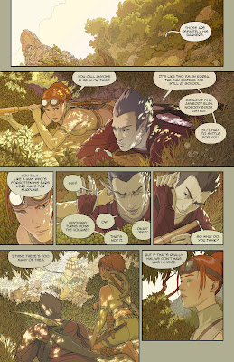
Hi! Here's page 5. Click to enlarge. I'll write some stuff underneath the image. I took a family vacation in the middle of this one, hence the two-week turnaround. This was the toughest page so far. The first time you draw a thing is always the easiest time, because you don't have to worry about consistency and you can tailor designs to meet compositional requirements. But the second time you draw that same thing, your right brain has to call your left brain in on the action, and things get ugly real fast. This page is almost all stuff you've seen on previous pages, but from different angles (the palanquin, the sister, the rocks, the dude's armor). I think I may worry a little too much about consistency -- people probably aren't counting how many grooves are etched into some guy's gauntlet. Anyway. Major time sink. Podcasts come in handy. Come to think of it, every page has been the toughest so far. Sometimes it feels like I'm running a marathon whil

Oh God, They've Started Talking

Image
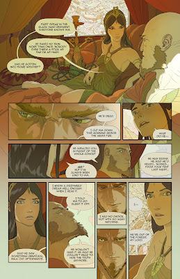
Page 4. Click to enlarge. More blabbing below the image. Faces are tough. It's amazing how sensitive we are to minor irregularities in proportion and symmetry. I remember when I was working on the Stareater comic (drawn in pencil on bristol), I'd end up erasing all the way through the board in places -- usually when a face wouldn't come together right. Doing it digitally is easier (because you can bump an eye up a pixel if it looks hinky) but also harder (because you can spend hours bumping an eye up and down by a pixel, trying to figure out which way works better). Dialogue is a whole other thing, and I freely admit that I'm bad at it. I'll be revising the text right up to the end, I'm sure. I had just read Riddley Walker (a post-apocalyptic novel written entirely in a massively-simplified pidgin English), and for a few days I had one of my characters talking like a chimney sweep. You have to be careful what you read while you're working on something like t

Page 3

Image
Page 3 done. Click to enlarge.

First Steps

Image
Here are pages one and two. I'll try to post each page as I finish (and double back as I start to color everything). Some of the images lose some legibility due to the all-overness of the detail. Color should clarify things a little. These were drawn in Photoshop using a Cintiq tablet monitor . Page 1. Click to enlarge. Page 2.

Some Random Things

Reading right now: 20th Century Boys, by Naoki Urasawa Real, by Takehiko Inoue After spending the last month watching the entire run of Battlestar Galactica, I have only one thing to say: all the radness that was the show? You erased it with that finale.

I Guess It Was a Good Day

Just so folk(s?) don't get the impression that I'm in some sort of suicidal confidence-spiral, let it be known that I had a pretty good day today. And the goodness of it was accentuated by the badness of yesterday. Alas, after three weeks of typing away on my new script, I showed it to Jiyoung yesterday. This is a woman who has learned to be very, very tactful in her critiques of my projects. The verdict? Well, she had something good to say about two of twenty pages. I went to sleep embarrassed, hopeless, feeling like I should throw in the towel. And then today, I charged back up the hillside and rewrote the entire thing. And though it's rough and first-drafty, it's not bad. So not bad that I feel comfortable starting concepts for characters. Tomorrow I'll do a polish pass. If that goes well, I've got enough script for the first issue of the comic. I originally intended to write the entire script from beginning to end before touching the stylus, but now I wonder

Where Exactly Is Waldo?

Some advice for aspiring screenwriters: if you find that your scripts are needlessly expository or just plain slow, try imagining that you're writing for a self-illustrated comic. Ain't nothing gets you to the point faster than imagining that you'll have to draw the same two talking heads sixteen times. The other thing: pace yourself. Creating something elaborate is a little bit like gardening. Just get out there and water every day. And when stuff starts growing, just go with it. Pull weeds (or don't, if they're pretty). There'll be fruit and flowers eventually. But not if you stop watering. I'm so terrified these days. Terrified that I'll suck. Terrified that I'm wasting my time. Terrified that my depths will be plumbed, and they won't be all that depthy. Terrified that this is the weightless moment at the top of my life's rollercoaster. Terrified that everybody else won and I lost. Terrified that my money is disappearing. Terrified that if

Pre-Mortem

As I write the script for Project Waldo (that's the provisional title for the graphic novel), I'm doing my best to keep things loose. If one thing made Stareater hard, it was that I had to break through ten years of ossified preconceptions about the story. Project Waldo is exactly a month and a half old. Some of its ideas grew from what I saw as conflicts between the world of Gordon and the Stareater (which took place in the future) and the way our real future seems to be shaping up. GatS had no robots, no AIs (well, okay, one really huge AI), no biotechnology, no real connection to our experience at all. There are lots of exciting concepts that I just couldn't touch with that story. So Project Waldo gives me a chance to do some near-future dabbling. Here's the basic idea: (Redacted due to spoilers) This lets me play with two parallel worlds -- one is a dystopian technoscape, the other a baroque fantasy realm. I get to do swords and magical creatures, but I also get to

Post-Mortem

A couple of people have asked me what's going on with this project, so here's the latest: Stareater has been put on the back burner. I think there still might be something salvageable there, but I'll need some distance before I can come back to it. Jiyoung told me that one of the things she's noticed in talking to Americans is that we all have "personal projects." I hadn't realized this tendency defined us until she pointed it out. Everybody is writing a screenplay, working on an album, putting together a portfolio. I don't know what this says about us. In Korea, people don't have personal projects, they have hobbies. I was really confused about this at first. Right after they ask you how old you are, they ask, "what's your hobby?" What does it mean, that they have hobbies and we have projects? I feel like there must be some revelation there. I should mention that when Koreans pursue a hobby, they go all-in. If they say "Salsa da