Flattened Earth Society
First pass on page 3 color. Click to enlarge. Below, I will try to keep things brief and I will fail.

The plugins are easy to install -- just drag the files into Photoshop's plugins directory and they'll show up under "Filters." There's only one tricky step - the black and white line art (not black on transparent, mind you) must be completely de-anti-aliased (re-aliased?) before the plugin will work. It turns out that this is done by selecting Image->Adjustments->Threshold. Bump the slider a bit to the right until all your lines connect, and then run Multifill. Multifill automatically fills every closed area in the drawing with a unique color.
Next comes Flatten, which removes all the black lines from the drawing and smooshes all your color patches against one another so their jaggy borders meet up underneath your lines. You end up with this:
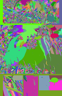
I stared at this way too long when it was first generated. It's like Mister Toad's Wild Ride for your eyeballs. I soon discovered that there were some areas where color had leaked (see the bottom-middle panel), so I had to go back a couple of times to tighten up the drawing (in the future, I will be much more conscientious about closing my outlines). Then began the arduous process of "flatting" -- that is, turning this patchwork of gobbledygook into areas of like color. After fifteen hours of hunting down leaf edges and little dangly bits, I ended up with this:

I didn't think too hard about my color choices at this early stage -- the idea is to set things up so that you can easily select objects in the scene and adjust their color later. To start, I just went with green for trees, blue for skies, and purple for people (of course). But back to that fifteen hours: does anybody know if there's a way to click-and-drag with the magic wand? If there is, I couldn't find it. The closest I could find was the Quick Selection Tool, which creates anti-aliased edges (very bad). Man, if I could have clicked-and-dragged those leaves, this would have taken two hours instead of fifteen. This whole process definitely convinced me of the need to outsource my flatting.
The flatting plugins produce one unexpected bonus: if you paste the multifill patchwork into your top layer, knock down the opacity to 9 percent, and set the blend mode to Soft Light, you get automatic variation in areas of repeated detail. I may someday look back on this trick with disdain (can you say "lens flare?"), but for now it seems like a really nice way to get big masses of leaves, rocks, or planks to look variegated. Not too shabby!
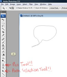
A couple of people have asked me what kinds of brushes I use in Photoshop. I use the default Brush Tool settings: normal mode, 100% opacity, 100% flow, 100% hardness. At my current image size, the 4-pixel width works best for intricate linework, while thick outlines get the 7-pixel treatment. Should I be using something more high-falutin'?
In other news, Brandon Graham has a new King City book on the stands. It's great.

Wow, this is looking really great!
ReplyDeleteI love your sense of epic... it's big, it's EPIC! Your fantasy feels really fresh and cool.
I can definitely see some of your influences here, like Darrow. Very cool, as you're not apeing him, but doing something new as well.
Anyway, I just wanted to encourage you to continue, even though all of that color work looks frikkin tedious.
I hope you're doing all of this at at least 300 dpi, so that you can print this sucker someday.
- Daniel
www.monstercommute.com
Just discovered this blog (thanks Drawn!)- I'll be following it. I really like the idea of building a project online like this. Your work reminds me just a bit of Moebius. Can't wait to read through everything you put up already.
ReplyDeleteThe Magic Wand options palette (tools palette? I'm not in front of a station that has it installed currently) has the option you're looking for, uncheck that "anti-aliased" checkbox and you should get hard aliased selection marquees.
ReplyDeleteI found some pictures of the option.
Yes, also thanks to Drawn! for linking to this.
Nate, instead of closing all the lines in your linework, you can try what I do when I use these filters - when I lift the line art up to its own layer, I leave a copy of it on the Background layer. Then I use Image>Adjust>Threshold to turn it into just black and white (I set the number wherever it works best but 128 is usually fine for me). Then I use the pencil tool sized to 1 pixel with Foreground set to pure black to close up any open lines or gaps I think will be troublesome.
ReplyDeleteSo then when I run Multifill, it keeps the bleed under control, while keeping my nice anti-aliased line art a little looser.
Yay Drawn!
Daniel - Thanks! No worries about the resolution - these are authored at 300 dpi@ 11"x17". I'm told that's a bit on the low side, but fine for print. And yeah, you can sort of tell I grew up reading Darrow's Hard Boiled over and over. He's pretty spectacular.
ReplyDeleteEric - Thank you! Moebius is eight billion times better than me, but I'm flattered by the comparison.
Lacrymosa - I've been using the Magic Wand in non-anti-aliased mode, but you have to click each selection area separately (a real hand-destroyer when you have literally thousands of tiny areas to select). I was hoping there might be a way of clicking and dragging the wand over multiple areas and adding the new selections fluidly. I think this may be a lost cause... Thanks for the link, though!
Jeff - Yes! I'll try that on page 4. Thanks for the pointer.
Good work.
ReplyDeleteAnd thanks for the multifill and flatten plugins. Brilliant.
But seriously dude. 16 hours just to fill the colors in ! WTF
I wish I had that sort of time to spent on my comic. As it is, with my job and family life to contend with, I am lucky to get three hours per picture, and that includes pencil, inking, scanning, PS cleanup and coloring. Thanks to the flatten and multifill plugins you linked, I hope to lower it to 2 hours per pic.
Keep up the good work.
I have learned a lot from your site, and I am sure I will learn a lot more as time passes.
I've been making comics literally half my life, and I have never made anything 1/100th as beautiful as this.
ReplyDeleteWell done, sir.
Fascinating blog, thanks for sharing what you're learning.
ReplyDeleteI just tried to recreate the problem you're having with quick select, but when i use it on hard edged patches of colour, I also get a growing hard-edged selection by click-dragging (auto-enhance deselected).
(apologies for the odd username)
Nate, you crazy bastard.
ReplyDeleteTo cut down on the number of areas created by the Multifill filter, erase the lineart in the trees and rocks. After making a copy of the lineart for safe keeping, of course.
Or, just wand the tiny areas around the edges of the larger areas, then pass the lasso around to grab the areas inside. You wand the areas around the edges to build yourself some room to move the lasso through without worrying so much about going over lines.
I recommend the poly lasso as it's MUCH easier on the old wrists. Then Alt-Backspace to force-fill the whole area at once.
The erasing method may be quicker. You don't need a perfect erasure. Just quick and dirty, destroy the boundaries between the majority of the tiny areas. -Plus- that will cut drastically down on the amount of time the Flatten filter takes to sort all the zillions of tiny areas out, since there won't be any, in theory.
At least you do close your larger areas. These filters don't do a damned thing for most artists' lines.
Also, instead of wanding, you can paint bucket with Contiguous on. The colours are laid down randomly by Multifill, so there's no chance of bucketing more than one area per click even if you have Contiguous off, but it takes a lot of CPU cycles per click to search every colour on the page to make sure there are no other areas with the same colour. Then, once you've bucketed all the little areas around the edges of the larger areas, wand that continuous area you've created, then use the lasso.
ReplyDeleteWhen I'm doing complicated L&K pages, I go back and forth between bucketing and wanding. Whichever my fingers do at the time.
If I'm not making myself clear enough, I can make you a quick tutorial using that bush in panel one if you want. PM me on GZ if you like.
ReplyDeleteYou can select several areas at a time with the wand tool if you hold down the 'shift' button , don't know if that addresses some of your quandries?
ReplyDeleteHaving spent a couple years as a professional flatter, I have to say that I never found multifill/flatten to be all that helpful. I always spent about as much time correcting it as I would have spent just flatting the whole thing on my own.
ReplyDeleteYou mentioned brushes: John Rauch (a FABULOUS colorist) has some brushes up for use. I seriously love these brushes.
http://eraserx.deviantart.com/art/Photoshop-Brushes-77303422
WOW¡¡¡
ReplyDeletefantastic i love it.
Wouldnt it be easier just to paint in the areas with flat colors by hand? Use the wand to select and fill big areas each with a different color, then hand paint areas that didnt work with the lasso. U will end up with transparent areas between sections, but the line art will cover that up. I think u could flat paint it in an hour or so????
ReplyDeleteNate has a bit of a self-loathing thing. It's best to just let him punish himself. It's therapeudic.
ReplyDeleteamazing work you have here..
ReplyDeleteas a budding artist, i must learn and follow your work here..
will put your link at my blog , sir
instead of flatting... try this:
ReplyDelete1. make a duplicate layer of your lineart, put it at the the top of the layer stack, set it to the "multiply" transfer mode
2. add a normal layer beneath your Lineart.
3. get a BIG FAT Hard Brush and brush in the background fill color. this should take about 30 seconds. You could use the paint bucket but... thats a hassle.
4. make the brush slightly smaller, change the color, and paint in the next smallest fill color. don't worry about being outside the lines at first. Work from larger to smaller, and background to foreground. if there is a smaller item on top of a larger one... paint right on over it when you paint the bigger thing.
5. repeat till you are happy with the fill colors. Try to stay away from the paint bucket, screw lassos, wands, other selection tools.
I agree with Kelli's comment above; trying to use an auto-selection tool on linework as complex as yours is probably not the most efficient way to go. I do my flats by hand with the pencil tool on a separate layer (with the line layer above set to multiply). Since my stuff is sort of animation-style I put the background color on a separate layer and go more painterly with that. I do the character flats on their own layer, turn on the transparency lock, then use Ctrl-J to make a copy of the layer to paint on.
ReplyDeleteThis comment has been removed by the author.
ReplyDeleteHello
ReplyDeleteI have some horror vacui too..
Man..i will follow u just to check how do u work on it.
I think about a comics in pointillism/stipple way, but i dont know who will buy it..=)
Hugs
M.Ramos
Came here via Drawn! and now following. I think you have a great epic sense, and your page layouts are damn fine.
ReplyDeleteHave you considered taking on freelance work, so that you can continue investing as much time as you can into this, but still make some contribution to putting food on the table? Sorry if that sounds stupid obvious, but you have more than enough chops, and I'd hate to see you give this up just for some dull old day job.
Also, about the detail in foliage, I'd suggest taking a look at some of the work Joshua Middleton does, e.g. http://joshuamiddleton.blogspot.com/2008/05/war-that-time-forgot.html or http://joshuamiddleton.blogspot.com/2007/11/ruby-key.html
He has a style something like yours, and he really knows how to use color and texture to imply a lot of detail.
Keep up the great work. You are, as Warren Ellis said, going to be monsterous.
I am here via Warren Ellis.
ReplyDeleteI buy about 10 graphic novels a year. I prefer the beautiful, the careful, the elegant, and the breathtaking. You, sir, fulfill all my preferences.
You've witnessed what happens when people get exposure to your work. You are passionate and pained by your work, and the chance that it might not be good enough. Thankfully, you have an incredibly (shall we say a french/belgian) sense of artistic integrity and style, and you will not compromise your vision. For these reasons, I believe your work will be as popular and successful as you would wish it to be.
Because so many of us came from Warren Ellis, we all believe in the power of Freakangels and it's marketing and distribution system. Post the comic to the web to get out there, and appeal to the people that don't like print and don't want to spend money, and then sell the book in the stores.
I have only read 15 or so pages of Freakangels online, and I special order the books from my local comic shop. I am sure I am not alone.
Your work is going to be a truly beautiful book of sequential art, almost like scripted paintings.
I'd like to make two suggestions:
Get a mailing list. People have short attention spans, and you want to be able to get everyone's attention back when you have something to sell.
Post your story and work online - online comic readers don't buy books, and book buyers don't hold off if it's free on the net. People love to buy beautiful things that they can hold, especially if there's something special about the physical object.
I am really looking forward to your finished product. I'll happily buy a few of them for friends and family.
Like everyone else that has commented, we can all just tell you are making something amazing.
etiennestrydom - This may seem flip, but maybe those time constraints will push you toward greater feats of economy and efficiency. If you learn any new tricks along the way, please post them here in the future. Good luck!
ReplyDeleteBrendan - Wow. Thanks! I really enjoyed your website, by the way. And some of the story premises are awesome - Citizen X, especially, looks like a very exciting book. Thanks for the compliment!
Admin - You know, I might be brain-farting on this one. When I color the next page I'll try this again (maybe I was accidentally on the wrong layer or something). Thanks for the heads-up.
Eagle - Crazy? Crazy like a fox! This is another one of your posts that makes me feel dumb. I'll be trying the line art erasing method posthaste. What a great idea. I am so mad at myself right now. Thanks again, man (or woman?).
Dominic - Thankfully, I did know that (yay! I knew something!). I was just getting tired of having to go clickclickclickclickclickclick.
Kelli - Thanks for the lead on those brushes! I'll be fiddling with them today.
AstroGuaje - Thanks, Astro! I am so envious of your upside-down exclamation points. Spanish gets all the fun punctuation marks.
RIKYU - In an hour or so? Really? You know, I remember a time (about a week ago) when I thought the same. Perhaps you are much, much faster than I am, but I found that the image looked deceptively simple at first, only to turn into a hideous time-suck. If you're still accurate at that speed, you should become the king of all flatters!
xyzboy - I know! Here's how masochistic I am -- one time, I sat next to this guy named Coop for like four months at GPG, and I forced myself to stay put despite the horrible smell. It was like working in the Bog of Eternal stench. Zing!
azhar - Thanks for linking to my blog! I hope all these awesome commenters keep coming up with useful stuff for us beginners.
eblu - ANOTHER very good piece of advice. Wow, you guys. This is great stuff. Thanks, eblu! I'll try this approach on the next set of colors, as well. I'll let you know if it sped things up at all.
Sankam - Pencil tool, hm? I'll try this, too. Thanks!
M.Ramos - Dude, your drawings are lovely. If you make a comic, you've got one guaraunteed customer right here. Those trains are magnificent! I hope you make those available as posters.
colin - You know what's rad about those Middleton links? He's working from photographs! I love it when art-superheroes turn out to use time-savers, just like the rest of us (I felt a similar relief when I discovered that Craig Mullins painted over photographs). But man, Middleton sure is good. Thanks for the advice about freelancing. I hope I can get fast enough to have this thing -- how do you call it? "Free time," I believe. By the way, I really like the stuff on your blog. An amazing range of styles and really great feel, all the way from the sketches to the paintings. Beautiful work!
cameo - Man, what a nice comment. I'm following Freakangels closely to see how it pans out as an enterprise. I hope you're right about people buying work they've already read online. I'm still grappling with that one. As to the mailing list idea - I should totally do this. Anybody know of a quick-and-dirty way to set up a mailing list? Thanks again for the confidence-booster, cameo!
Did not read all coments above ...
ReplyDeleteFirst - impressive work! Coloring feels a bit light and to greenish to me. I added a color/saturation layer in PS and set it to multiply (60-80%). Makes it a bit heavier/richer for me. Did you tried a black background/paper color? Also you can try unsharp masking with 50/30 and set this to 10-30 percent (we call this contrast-sharpening) - uhh maybe u know this already.
Great work so far!
Dude, you're so not dumb. I was a noob at this too.
ReplyDeleteBefore I started flatting, I had used Photoshop for my own personal reasons for ten years. I quickly realized I had no idea what I was doing in this new context. It was taking me whole days to do two pages, much simpler than yours are. Two years later and I'm still tweaking my approaches. It took me months to just realize the benefit of having the lineart in a channel instead of a layer while flatting. Duh! I was getting them in channels, but would put them in layers out of stubbornness and a refusal to figure out channels.
When I discovered the filters, it took me dozens of pages to get comfortable with them.
You should've seen how pathetic my first ten-page project turned out.
I'm a guy. ;)
Beautiful work and you're very clear in explaining what you're doing. Instant fan. I'm just about to enter into learning to color digitally. I'll be looking here for pointers.
ReplyDeleteJust followed a buddy's link to this site. Your art looks wicked. Don't worry about your photoshop technique, It looks like its working for you. I'm getting a comic book going myself, but more as a writer than artist. This blog has inspired me in my self publishing aspirations. Thanks!
ReplyDeleteThis guy....wow. I just discovered you and I think you are my new hero. Well one of them.. at least someone i definitely admire a little bit. Maybe. I will follow you.
ReplyDeleteRonald - Interesting points. I did fiddle quite a bit (like, for two days) with contrast settings. In the end I felt like more saturated color competed too much with the linework. But what is this unsharp masking to which you refer? Sounds fancy! Thanks for the advice!
ReplyDeleteEagle - Just because other people here might not be as smart as I am... what exactly are the benefits of keeping the lineart in a channel? Ahem.
Matthew - Three words: shark vs. squirrel. You rock. Hard. My first pointer: continue rocking.
PanicAttak - Thanks! And good luck on your comic!
JDHP - Not if I follow you first! I sure do like your square-headed robots.
I am now rooting for you and your John Cassidy styled art. Go go smooth details.
ReplyDeleteWhile the lines are in a channel, they don't get in your way. And they take a bit less space when saving the file. Every time you open a file, though, you have to show them again, unless you change them to Spot mode. They'll show when you open a file, but you can still hide them if you want.
ReplyDeleteThe first time you put them into a channel, they'll appear red. Change it to black and the opacity to %100. If the black and white are inverted, change the mode to Selected Areas instead of Masked. Photoshop should remember you've made these changes so they'll be automatic the next time you do it.
Then you can change to Spot if you want. It won't remember that. For some reason, you can't change back to Masked or Selected after changing to Spot. Dunno why.
Get to these settings by double-clicking the little preview thumbnail in the channels palette.
This is more important during the flatting stage. You can't accidentally eyedrop black by clicking on areas of heavy lineage.
I have an Action to do it for files I get that have the lines on a layer.
Since I'm a flatter, this is of more importance to me. Colourists eventually have to put them back into a layer in order to work with them.
If you look at John Rauch's process videos, you'll see a fun way to use lineart in the finished product.
Are you saving your files as PSDs or TIFs? Depending on the particular kind of data in a file, it will save smaller in either one, but will always save faster in PSD.
Michael - One of the things I love about these comments is how often you guys open my eyes to new art. I'd never heard of John Cassidy before, but he's great! Thanks for the lead!
ReplyDeleteEagle - I've been saving them as animated gifs. That's the highest-resolution option. It automatically adds fine detail to the drawing, like magic, and all your characters start moving around, which is a nice bonus. Actually, I save as PSDs. I'm gonna go check out the Rauch vid right now. Thanks for yet another nugget of pro-wisdom!
Michael (again) - "Go go smooth details?" Worst. Inspector. Gadget. Power. Ever.
ReplyDeleteGo Go smooth details gets Gadget all the ladies. Never doubt the smooth details.
ReplyDeleteYou're most welcome!
ReplyDeleteLet's see if you can come across anything else I happen to have an answer for. :D
Brilliant
ReplyDeleteContrast sharpening is just unsharp-masking (wikipedia explains it) with low strenght and big radiuses. For example usm with strength 10 and radius 50 is something we use everyday...
ReplyDeleteIf the strenght is to high u get some kind of aura around contrasty forms. Normally we try to avoid this effect but u could use this to manipulate colors along forms - some kind of gradiental change - cant explain it better with my poor english :)
regards!
Michael - Now I'm imagining the deployment of Armani cuff links and a turntable playing Usher at low volume. Cause those are some smooth details.
ReplyDeleteEagle - I'm sure there must be at least one thing left in the universe that I don't know. If I can find it, I'll post it here.
Christian - Thanks! I'm totally digging your typeface blog. Have you finished the new font yet?
Ronald - Wow, that's an interesting tool! Yet another thing for me to fiddle with for hours. Thanks!
At the risk of repeating some of the techniques above:
ReplyDeleteWhen I'm coloring in line art, I take a pretty simple approach which I think avoids some of the endless clicking. I usually start a PSD in grayscale. Starting with a grayscale scan, I lasso a bit of a single white area, choose Similar under the Select menu and delete the white parts of the picture. I then usually do a simple Brightness/Contrast adjust to get rid of any odds and ends of gray on the edges (there are usually few to none anyway if the scan is decent). This leaves just lines on their own layer.
Then, I create another layer beneath that one. Back on the line layer, I just magic wand any parts of an object -- say, the bits of a tree trunk. I then choose Expand in the Select/Modify menu (usually just one pixel... more is cool if you're working uber high res). Without deselecting, I go to the lower layer and do a grayscale fill. I just rinse and repeat that until I have a basic grayscale coloring done for the piece. I then change to RGB (or CMYK) and begin coloring the gray layer (after I duplicate it for safety).
The cool thing about this approach is I can either magic wand a chunk of similar gray, or do the lasso/similar bit again and do some basic hue/saturation stuff before getting more detailed. It's also nice that the color bits aren't usually touching, so it's easy to isolate a color, or give it a separate layer.
That's pretty 101 -- And my drawing style is WAY simpler than yours, but I figured what the heck.
I'll be around. ;)
ReplyDeleteClayton - I like the intuitiveness of your approach. I'm sort of stunned by how many different paths there are up this particular mountain. Thanks for sharing your expertise!
ReplyDeleteClayton, all that wanding and expanding (especially the latter) is what the flattening plugins do automatically. (By the way, there’s a flattening plugin available for the GIMP now, too.)
ReplyDeleteit's great to see that post by post you get more comments and feedback, by the time i get to your current post i reckon there will be like 100-200 comments per post lol!
ReplyDelete