Bubblicious
Page 6 colorized. Click to enlarge. More after.

I learned a new lesson this week: never draw speech bubbles directly into the original line art. I'm pretty sure somebody made a comment to this effect several months ago, but I'm a late bloomer. There are a few really good reasons not to bake speech bubbles into the drawing:
- The dialogue may need to change (as it did with this page).
- I may want to change the way I draw the bubbles, themselves (with this page, I switched from the old hand-drawn bubbles to stroked paths, which will be easier to modify in the future).
- I'm going to have to change the font (suggestions welcome), which means I'll have to resize the speech bubbles later, anyway.
- I want to publish the book in other languages, and I'll have to resize the bubbles to match the localized text.
- I may want to use the panels in an animatic someday, in which case I'll want the bubbles removed.
- If I ever want to sell prints of individual pages, they'll probably sell better without the text.
That said, the bubbles need to be a part of the composition from the very beginning. They just need to be on a separate layer. It took some time to re-draw all the bubble-hidden detail for this page, but I'm glad I did it:

Another lesson learned. I'll double back and remove the bubbles from pages 3, 4, and 5 in the coming weeks. That's what we artists call "eating your vegetables."
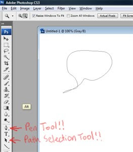
Ah, before I forget: paths are rad. Once again, a commenter recommended this months ago. I had known about paths for years, but for some reason hadn't really played with them too much until I picked up the DC Comics Guide to Digitally Drawing Comics . The moral of the book: paths are rad (it has other morals, but I am prohibited from learning them until I've wasted a few thousand more hours doing stuff the wrong way). But yes, paths. I am a convert. Never again will I spend fifteen minutes redrawing a long, curved line by hand.
For the uninitiated (i.e. me, a month ago), paths are vector-based lines that can be manipulated with little handles. You bend the handle, the line curves. You need to make the line zig, you add a new handle and bend it the other way. The paths live in the paths palette, which sits just to the right of your layers palette. The path tools sit near the bottom of the toolbar -- you really only need two of them to start: the pen tool and the direct selection tool. Try different combinations of ctrl, shift, and alt (or the Mac variants of these keys, which I think are command, lilt, and traipse) to see how these tools alter a path. Once you've got a path, right-click it and select "stroke subpath." BAM! Photoshop traces the path with whatever brush and color you've got currently selected. Instant smooth line. Now go have an Asahi. Note that it is super dry.
On to new business! Namely, my ongoing quest to get faster. I could really use a breakthrough on this -- I feel like I've been achieving incremental efficiency improvements, but what I really need is to go twice as fast as I'm going right now. I'll be trying out the following tactics this week:
- No internet (this time, for real).
- Start each day with fifteen minutes of planning. Set small, achievable goals.
- Systematize the coloring process: do all shadows at once, do all highlights at once.
- When stuck on something, switch to a new task and let the old problem percolate in the background.
- Spend more time on the rough underdrawing -- work on it until the proportions and composition are correct. This should reduce the amount of time spent erasing "finished" line work.
- Hire a flatter.
- Take more small breaks to prevent short-term burnout.
- Get a more comfortable chair (I'd imagine that in the current economic climate, the market would be glutted with abandoned office chairs).
- Check out more audio books from the library. Preferably, ones that don't suck.
Does anybody have any other ideas?
Finally, many thanks to Craig and Nathalie Kaplan for translating my pitch letter into French for me. With their help, I've added some French names to the list of publishers who are now looking at Project Waldo.


hello
ReplyDeletekeeeppp working
nice valuess
hugs
M.Ramos
Niceeeeeeeee! Really like it!
ReplyDeleteHope this helps with #9:
ReplyDeletehttp://librivox.org
hey! Congratulations, I really love this project, your drawings, color and learning from your first handed experiences =)
ReplyDeleteI might not post a lot here, but I'm an avid watcher!! Keep on going!
Cheers!
Woka
Nate, this looks great.
ReplyDeleteSpeed is the bane of us all. I do suspect that experience does help and you're getting that right? Best of luck.
It seems to me, flatting is the least of your worries at this point. You seem to have a good system going there.
ReplyDeleteAs for the chair, as far as I know, the best available is the Aeron by Herman Miller. If you happen to watch House, it's the one he has in his own office. You can grab them off eBay:
http://shop.ebay.com/?_from=R40&_trksid=p3907.m38.l1313&_nkw=aeron+chair&_sacat=See-All-Categories
If you have the scratch for it, anyway.
They're coming out with a new version that looks really sweet, but has an MSRP of $1600, so it's a bit exaggerated.
What genre of audio books do you like? I've listened to buckets of them while working. Mostly fantasy and sci-fi, though. I don't need anything that requires too much thought.
At least you realized the text bubble problem this early in the book!
The page looks great, of course.
I draw the bogies for dandy xtreme It tends to take me a day a page. (is that fast enough)
ReplyDeleteThat's everything. Writing, penciling, inking, colouring, lettering.
With colouring I've found it's best not to think too much just pile thorough. colour it all in using the obvious colours.
None too subtle.
Then using marquee tools, layer masks, hue and saturation and replace colour you can fix it.
Then shade and highlight.
It's easier to fix than to get it right first time.
And when you think it's right, print it out, because you'll spot extra stuff then.
Maybe you should batch your pages more.
ReplyDeleteI know for some of the Sin City books, I think for Family Values at least, Frank Miller did all the roughs first, then pencils, then inks.
Maybe you wouldn't want to commit to such a factory line process for an entire book, but perhaps you could work in batches of five or more pages.
No internet? But the internet is IN the computer, which you are coloring on!
ReplyDeleteTemptation will be your 24 hour companion.
Hehe, I learned the same thing about bubbles after completing my second volume... Now I keep them separate, but I agree that it's essential to plan them from the beginning, as opposed to sticking them on after the page is complete.
ReplyDeleteI was going to suggest batches as well – I find I work MUCH faster if I pencil 3-4 pages in one go, then ink them all, then color them all, etc. Somehow the switch from one step to another seems to eat time, and the less one has to switch the more is accomplished.
I do audiobooks too, and this may sound strange, but upbeat music can actually accelerate your work pace. It's stimulating, the same way soft music tend on the contrary to slow us down.
M.Ramos - Thanks dude. Your hugs are going to get me through this.
ReplyDeleteNiezam - Thanks very much! I think it's better than page 5, anyway. Still waiting for that breakthrough, though.
Dennis - I have no idea how I've never heard of librivox. It is just the coolest idea in the history of the universe. Thanks so much for the link! (I really like the comics at your site, too!)
Woka - Thanks man! I really like the stuff on your blog, too! Such unforgettable, strange characters, and a deceptive looseness -- you've actually got great control. Really great stuff!
JP - Hi again! Yeah, I hope there'll be some kind of gradual improvement with more experience. It certainly hasn't shown up yet, though. I think if I'm going any faster, I must just be plowing those gains into more detail. Maybe this is more a question of discipline than speed...
Eagle - Long time no see! I still would gain a day by hiring a flatter. That adds up to about a month if you take a whole issue into account. As to audio books, we are totally on exactly the same... page!(badump-bump) I am a sci-fi maniac, but the Seattle Public Library's online audiobook selection is a little anemic right now. For the last couple of months, I've been pushing through the Aubrey-Maturin series (Master and Commander). Great stuff, but not enough lasers.
spleenal - Bogies? Dandy? Xtreme? Don't tell me what those really mean -- I'm nearly certain you can't beat what's in my head. A day a page is freaking super-fast, and I am totally jealous. I'm more in the week-per-page range right now. The advice about printing it out to find stuff to fix sort of terrifies me, though. I've yet to print out any of this -- I know I need to, but I just don't have the guts yet. I'll need to be drunk, I think. Thanks for the advice!
brianmanton - You and Joumana have an interesting idea there. I think I'll give the batching a try this week. The only possible setback I can think of is that switching to color lets the linework part of my brain take a little vacation. I wonder if I might be courting exhaustion? Let's find out! Thanks for the good idea!
Michael Pfeffer - Maybe I can exorcise the internet out of my computer. I'll try dumping holy water on it.
Joumana - Hello again! It's nice to hear that some other folks made the bubble mistake, too! With some of these lessons, no matter how many people advise you to do otherwise, they can only be learned by screwing up on your own. And I totally agree about the utility of upbeat music. Especially with repetitive tasks, I find that booty-shaking tunes help my hands to move faster.
The Pomodoro Technique is all the rage in Agile programming circles these days: http://pomodorotechnique.com/
ReplyDeleteMaybe you can find some illustrative application.
This can help with the above: http://online-stopwatch.com/full-screen-stopwatch/
Nate, This new pages looks amazing! I LOVE the lighting shining through the trees on the characters. Very inspiring stuff.
ReplyDeleteI don't know what to say about the speed thing. I tend to have moments of speed in my work mainly when I give myself smaller realistic goals for the day or week. But when I start to get burnt out, I definitely have to just stop and rest and take my mind off the project for a few days otherwise I start trudging through it and not enjoying myself. So I guess my suggestion is to take breaks and vacations.
Also I'm a total fan of throwing down color everywhere and then adjusting it all in the end. Keep it coming. I can't wait to see more.
incredible work.
ReplyDeleteMan, this is so good it hurts...actually it´s not good...every line and color they are just so.. perfect...aaaah...it burnszzz!!
ReplyDeleteHave you heard of The Lost Fleet series by Jack Campbell [aka John G. Hemry]? The tactics and fleet engagements are great fun, but the characters and conversations drive me a little nutty. Still, I can't wait for the next book to see what comes of all the twists and turns. It's a very satisfyingly "real" account of space warfare.
ReplyDeleteTerry Pratchett's Discworld series is ostensibly a "fantasy" series, but it's actually kind of sci-fi too. Altogether one of the best and longest series of consistently entertaining books I could hope to read. Anything he's written, really, is satisfying on many levels.
Anything by Frederik Pohl that you can get your hands on is a gem.
Of course, I don't know what you've read or listened to. You may already know that The Forever War and Starship Troopers are supposed to be the two best sci-fi military stories. I enjoyed both for very different reasons.
I'm not particularly big on historical books, but if you say Master and Commander is a good series, I'll have to check it out.
Douglas - I've never heard of the Pomodoro technique, but it sounds interesting. Have you tried it?
ReplyDeleteJason - Thanks, Jason! Every time I post a new page, I worry a little about how it'll be received. It's good to hear that this one cuts the mustard! I'm following your project eagerly, myself. I'm really digging the subdued palette so far, and the textured color effects are just so lovely. I'm really stoked that you're doing this.
mike - Thanks!
mikemaluk - Wow, dude. That's nice of you to say. Never have I so enjoyed being told my stuff was "not good!"
Eagle - I have NOT heard of the Lost Fleet series, and as I totally dig all the other stuff you listed (Gateway is one of my all-time favorites, and I enjoyed both The Forever War and Starship Troopers), I will be checking it out posthaste! You should definitely check out the Aubrey-Maturin stuff. It's my first time dabbling in either historical fiction or the Age of Sail genre, and I can attest to its all-around greatness. This is actually my second time through the 23-book series.
Mightily impressed.
ReplyDeleteas usual, this is fantastic. You did this earlier as well, but I love how when the pov is indoors or in shadow, that the sunlit areas are very bright and washed out.
ReplyDeleteCool. I'll get started on it as soon as I finish the book I'm listening to now [Star Wars filler until I figure out what I really want to listen to].
ReplyDeletednwilliams - Thanks, man!
ReplyDeletebykamon - Yeah, I'm trying to sort of hint at some kind of retinal effect -- where the shadows either go dark or the light areas blow out, depending on where you point your eyeball. I'm happy that it works for you. Those shots take the longest, because I end up tweaking blend modes till the cows come home to get the contrast right.
Eagle - Because of your name, whenever you write anything I imagine the voice of the big blue eagle from the Muppet Show. It's rad.
Hahahahahahahaha. That's a great voice to be imagined with. ;)
ReplyDeleteHey Nate!
ReplyDeleteAmazing page,
I empathize with the needing to get faster...I could make much more if I wasn;t soooo slow.
I know you are kickin' butt with the pages, but it's always cool to see how others work...so
Joe Quinnones posted a how he does his colours on his site
http://joequinones.blogspot.com/2009/11/step-by-step-kraven.html
That may be of some help process wise...
The biggest thing is that he uses a flatter..and from my talking to some flatters, a page in an hr or less is standard...well worth the money if they are good!
He uses a fellow named Orpheus who seems really great and professional...and reasonable.
http://www.orpheusartist.com/
In regards to Lettering
Blambot has some awesome articles on their site as well as free balloon and sfx templates....oh and the dc guide to lettering and colouring is great for lettering advice and technique...oh oh...and audiobooks...Malcom gladwell's outliers and what the dog saw(heck any of his books) are just amazing.
Cheers!
and keep it up man!
Kelly.
A flatted page in two or three hours is "standard." But it depends on the amount of detail. You can't expect your pages, Nate, to rate at the bottom of the detail heap. I've done some of the Frazetta pages in less than an hour, but those are absolutely the exception.
ReplyDeleteoops sorry Eagle, great point...Nate's pages arn't lax on the detail or background dept. And I hope that I didn't slight any flatters out there...I only asked a few for my own reference.
ReplyDeleteNo problem. ;)
ReplyDeleteIt's not something easy to understand if you haven't been doing it for a while.
Lookin' good Nate. Go go go!
ReplyDeleteKelly - Hey, that's a lot of useful stuff right there! The Joe Quinones thing was interesting on several levels (not least of which was the extra challenge inherent in working in analog media -- transferring the image with a lightbox?!?). As to flatting, I have indeed already tried to subcontract my flatting to someone else, but it took a lot, lot, lot longer than one hour for him to finish. I suspect I'll end up paying a little more than the industry average for flatting -- I'm still on the lookout for somebody who's up to the challenge. Thanks for the awesome comment!
ReplyDeleteEagle - Yeah, my pages take more than an hour. I think I've gotten it down to about three hours, but that's if the page is on the light side.
Rayford - This is all your fault! How are things going with Jack-Jack?
Damn... Sorry you're having a hard time finding a good flatter, man. :/
ReplyDeleteI'd've loved to offer my services, but my plate is already brimming with work. Not to mention I'm trying to build up my colouring portfolio so I can start doing that soon.
GZ has a lot of flatters hungry for work. There's got to be at least one decent one lurking there besides me.
Great! I always look forward to your updates! I find these journals informative and inspiring.
ReplyDeleteEagle - No problem. I admit I haven't looked too hard for a flatter yet. I've got it so optimized that it's not that much of a time-sink anymore, anyway.
ReplyDeleteSierra - Thanks very much! I'll try to pick up the pace a little bit.
That's what I thought. ;)
ReplyDeleteHi, just posting to let you know another interested reader has bookmarked your RSS feed; thanks for sharing your experiences with us :)
ReplyDeleteThe flatting/multifill plugin looks really useful. I have an idea for an alternate way of making it more manageable than erasing lines, but I want to test it before posting, and before that I'll need to finish my homework :) Ugh finals
Hmm, that experiment didn't turn out so well, but I did have some success with another one using those flatting plugins when it came to lighting. I'm not sure where I can post a .psd file (and thus help show how it was done). But I can show the resultant image:
ReplyDeletehttp://tinyurl.com/yf7d5m3
The two additions are crepuscular rays and, for some angles, leaves that are illuminated by the sun shining through them (as opposed to light bouncing off)
First, I used multifill/flat, used the Quick Select Tool to grab just the leaves, and copied these to two new layers (this is what took the most time, but only because I didn't have your original flats to use). Lowered the saturation, adjusted Curves, and set the layer to Screen. This created some highlighted leaves in the top and right sectors, where the sun is shining through.
Then I took the other copied layer, desaturated it, colored it similarly to the surrounding leaves, and did a long diagonal motion blur. Then I dragged these blurry lines down and left; thus I got the crepuscular rays projecting through the leaves.
Then I copied your fantastic original artwork, and cranked the Curves so that I only got the brightest highlists in the picture (the direct sunlight on their backs, the bright leaves in the bottom left, for example). I set this layer to screen, applied the same motion blur, but moved it up and right so that it reverse-projects off the highlights; thus, crepuscular rays appear to be connected to the highlights on their backs.
At this point, even though I was using additive filters (screen, soft light), the lightness was capping out a bit and the colors washing out. So I created another layer that would dark areas shaded by the leaves.
Overall, this operation took me maybe 15-20 minutes to work out. Once you've got it figured and integrated into your workflow, it'd probably take 2 minutes to implement, 5 minutes to stop nitpicking. Woot!
If anyone knows a good place to post a .PSD file, I'd be happy to share.
Nobbynob - I like it! The nicest thing about your experiment is that it enlivened the flat color of the elf-guy's hair. Also, I'm happy to now know the word "crepuscular," which I intend to skillfully weave into general conversation as often as possible. Thanks for taking the time to do the experiment and post at such length about the results. Cool!
ReplyDeleteHey Nate,
ReplyDeleteI like your lists. I need more lists in my life. And as always you are doing some damn exciting work.
We should start compairing audio book lists--since that helps me stay at my desk as well.
I'm all about this british comics show
http://housetoastonish.podomatic.com/
and Hemmingways The sun also rises
and the forevor war and multiple robert heinlein have been my favorates so far.
--Brandon G
Brandon - Thanks, dude. Here's how sympatico we are: House to Astonish is already my favorite podcast, and that's saying a lot, as I generally know nothing about the topics they cover. They're witty, smart, and somehow instantly likable. As to The Sun Also Rises, the Forever War, and Heinlein -- I've already read all of them. In fact, I'm pretty sure I've read all of them twice. Okay, when I say "all of Heinlein," I am totally lying. "Have Spacesuit, Will Travel" is his only major book, anyway. Right?
ReplyDeleteI cannot, cannot, cannot wait until a full-color Brandon Graham book comes out. Just the thought of it lights up the same parts of my brain that get excited when I see that there's one chocolate croissant left at the coffee shop. I want to eat your color. Also, come back to Seattle soon. We miss you.
Hi,
ReplyDeleteI discovered your blog over Scott McCloud's Journal just a few days ago and have digged through all your older posts and now feel the urge to give some feedback to your journey before I continue to follow it (fortunately on the much slower pace of your updates and not in that "can't stop reading until I have catched up" manner that overcomes me everytime I encounter an interesting blog with several month of history).
I'm very thankful that you took the time to write about all your ups and downs. In my opinion, that's the most interesting information for people who try to direct their live into a new direction and follow their inspiration (hint:me too). And nothing less are you doing. A funny detail is, that I also enjoyed the 'making of' on the "Tekkonkinkreet" DVD for it's honesty concerning failure. It's really rare to see people talk about their struggles. The Japanese may have a different view on that. The 'making of' on the "Paprika" DVD is quite similar in this respect.
Well, I could write on for pages but I will cut it out here. I'm looking forward to your progress and will follow it with great interest. I still have a lot of feedback I want to give to you but I will just postpone it to future comments.
Keep up the good work!
Daniel - I can't wait for your comic to come out. Seriously, it just looks like the most awesome thing ever. Your paintings are gorgeous, the world you've developed is gorgeous -- just seeing "The Journey Begins," I was instantly on board. I, too, see a lot of parallels between our two experiences, though in your case I feel there is a real chance that your project could become something very, very big. As in movie big. You've set the quality bar so high, I hope you don't get worn out along the way! If my encouragement can help at all, I'll be following along and cheering from the sidelines. I've got your blog bookmarked, and I'll be watching with great anticipation!
ReplyDeleteThanks for dropping by!
Hey Nate,
ReplyDeleteso you instantly figured out that I too am secretly longing for the movie version. Well I guess that's just the holy grail of storytelling for our generation and the medium that told us most of the stories we hold dear memories of. I was thrilled to see that you originally planned to do a storyboard and go straight for the movie. I was delighted to see you drawing the same conclusion that I drew somewhere in the middle of this year - that the comic is the medium that comes closest to the movie experience AND is managable for a single artist. There was one little thing that was holding me back on that conclusion for some time: I had never cried over a comic. A few month ago I reread "Akira" by Otomo and there it was - my first tears over a comic book. That sealed the deal for me. Now, after digging deeper into the online comic world and after revisiting the Scott McCloud books I'm even looking forward to the richness of the comic medium.
I few weeks ago I found a comic book on the blog of an artist from Japan. I hope you don't mind me to post the link here:
http://halcyonrealms.com/illustration/miyazaki-hayaos_the_journey_of_shuna/
It's an early manga by Hayao Miyazaki. What struck me was to see that he also started small. You can even see how he salvaged characters and scenarios of this comic for his later films. And he was already over 40 years old when this manga was published.
I felt this discovery to be very encouraging. It told me that every step is important. Even the hard and desperate first steps where you often have to chance pace and direction are important. They are the evidence of the fact that one is willing to suffer in order to make a dream come true.
You can be very proud of your achievements of this year. Someday somebody will dig out this old blog and won't believe his eyes how everything started in the first place.
I also appreciate your feedback concerning my project. I say, we just keep an eye over each other and do our thing. In Germany we say "shared pain is half the pain". :)
Daniel - The more comics artists I meet, the more I realize that adulation of Miyazaki is nearly universal. Mignola seems to be a distant second. They're both living the dream: creative control, public acclaim, success beyond anyone's wildest dreams. What I didn't know was that Miyazaki started this journey so late in his life. Granted, he worked in animation from much earlier, but it's great to think you can surprise the world with something so long after most people have written you off. He's a big inspiration!
ReplyDeleteThanks for the great link, too! What can I say: the man likes to recycle. Might as well use every part of the animal.
hey nate thought you might like this: http://artistsketchbooks.com/step1.php
ReplyDeleteIIRMSOST (seriously, that's a long name) - I've been staring at that site and I'm still not sure what it does... should I just sign up and see what happens?
ReplyDeletePerhaps I'll do just that!
Your comic is truly stunning, the color and layouts are wonderful. Hope it gets on the shelf soon.
ReplyDeleteSean - Thanks for the compliment! Your blog is GREAT. It was very hard for me to believe that all of the art was made by a single person. You're really pushing yourself in a lot of different directions. And succeeding in all of them! That sea monster just kicks so much butt. It all kicks so much butt. I'll be following you from now on!
ReplyDeleteThanks for all the inspiration..time to get crackin' for myself!
ReplyDeleteWay late in this thread - but if you're ever stuck for a flatter I'd love to help out! I can send a load of samples if you need.
ReplyDeletecheers